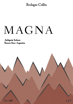

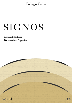


Looks a little flat
Better use of white space
ml and % are not easily visible
Try to add more depth maybe
Less of a monochromatic color scheme amongst the different labels
Add some more color
Different design for the main illustrations on the labels
Add something more interesting for the background, not just flat white
Change the texture for the illustrations